Spring 2020
Task: Design a typeface from start to finish. It had to be a text typeface, not display. Something we could set paragraphs in. This might be the most fun project I have ever done.
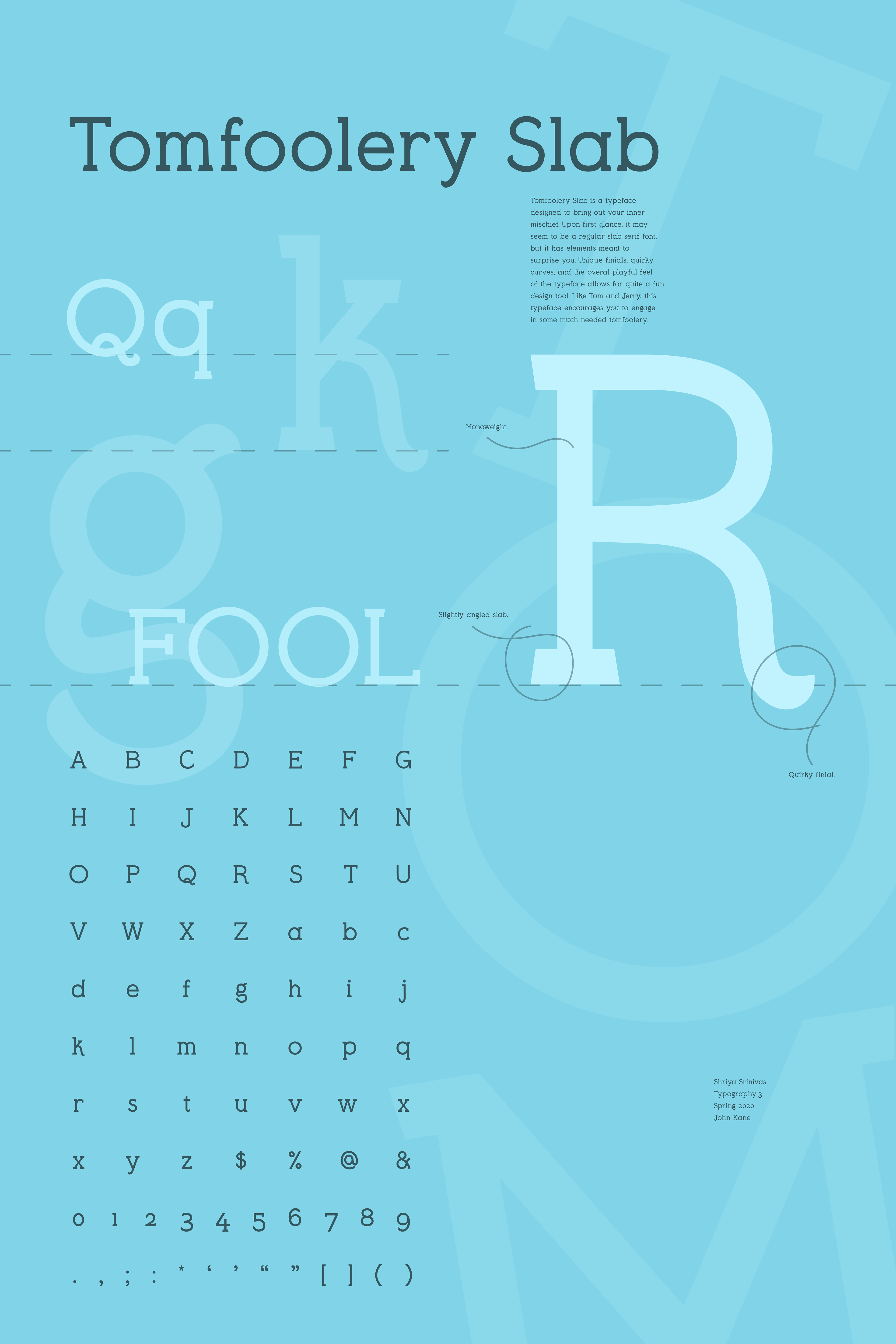
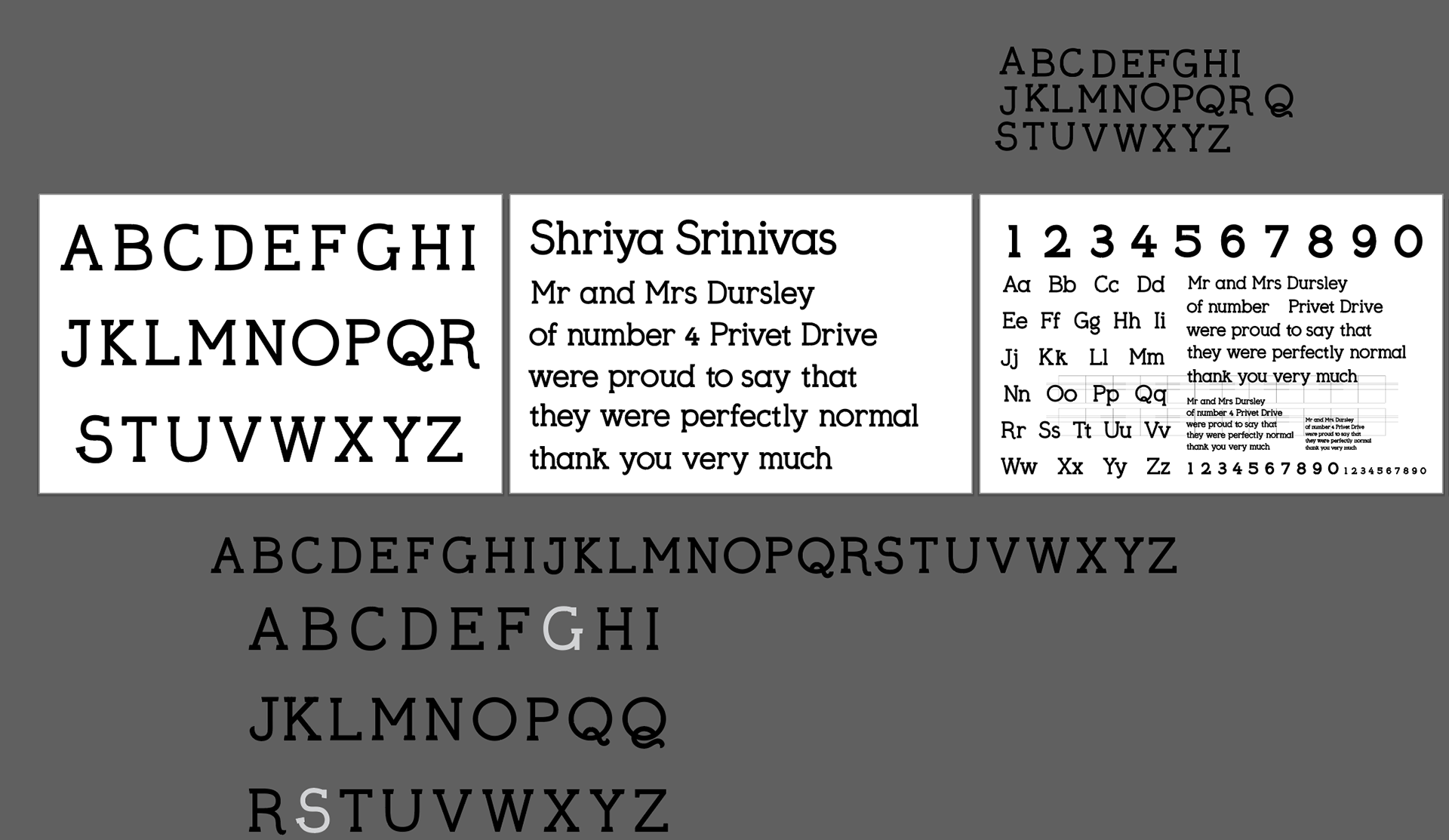
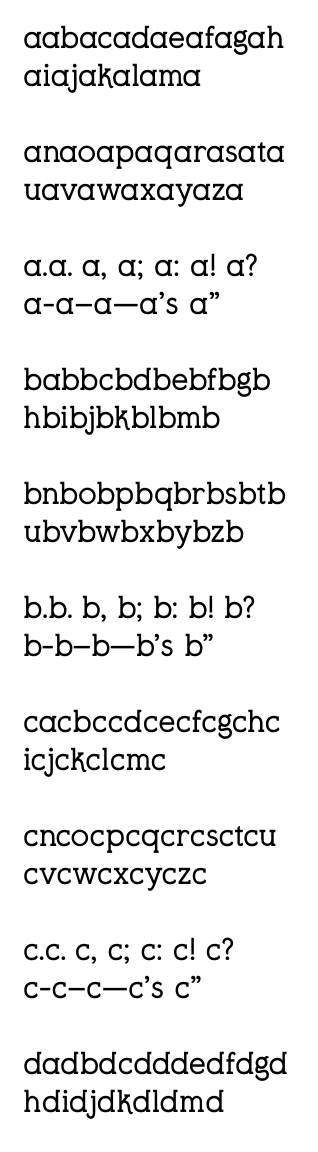
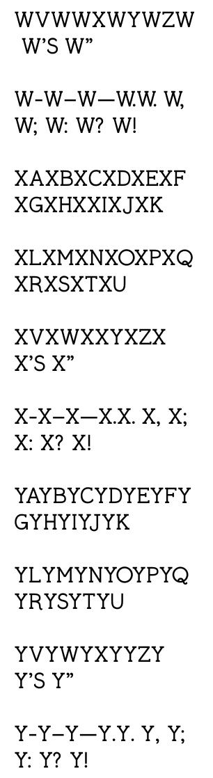
The final product of this project was to create A2 Posters that presented the typeface in a unique way. I named this typeface Tomfoolery Slab as it had some fun and quirky moments that needed to be acknowledged. The lowercase g, the leg of the uppercase R, the uppercase Q – all characteristic of this typeface with their rounded finials.
Artistic display of the typeface
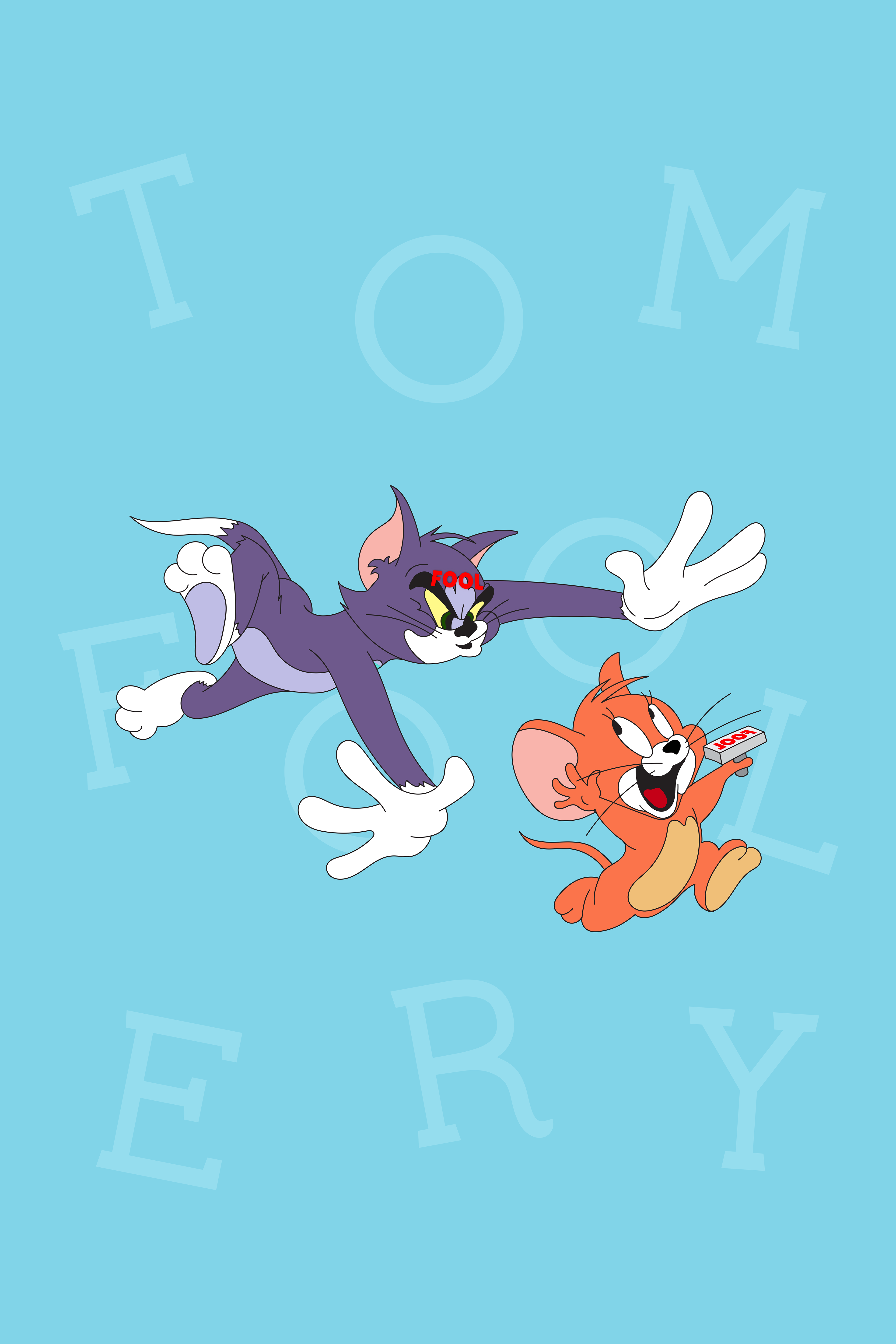
Tom is a fool, and Jerry is the epitome of tomfoolery!
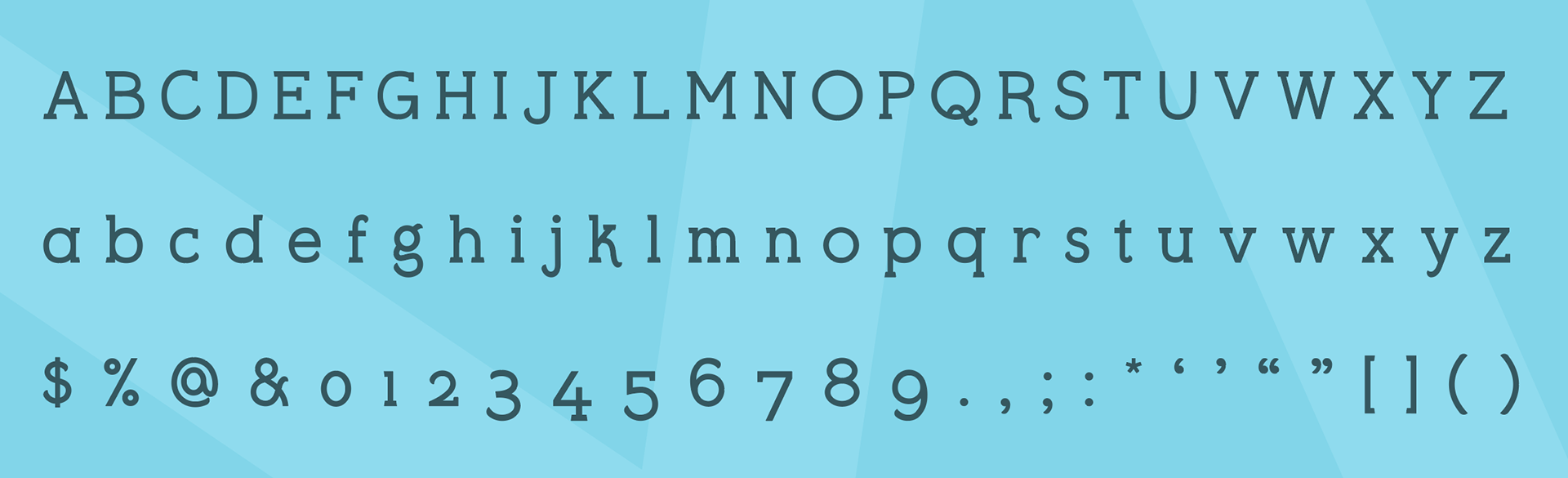
The Typeface
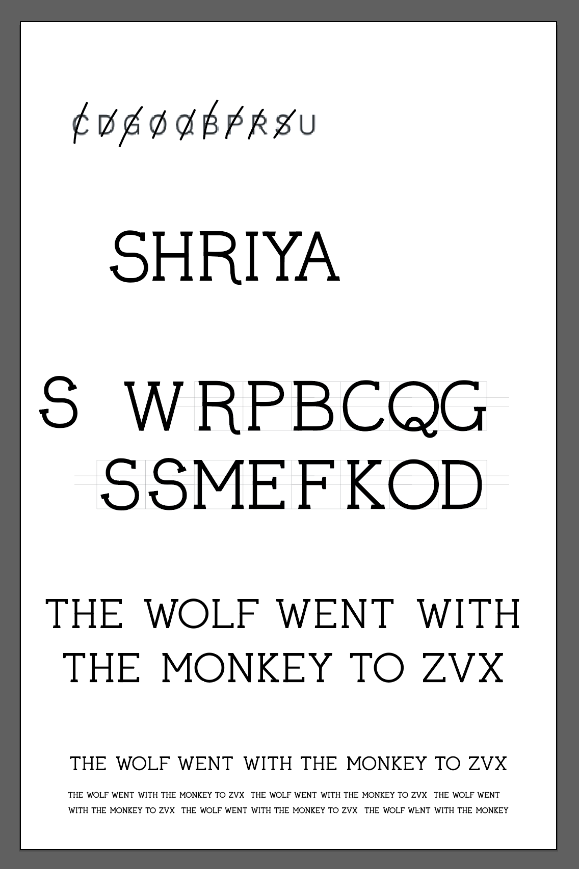
The Process
Edit Edit Edit
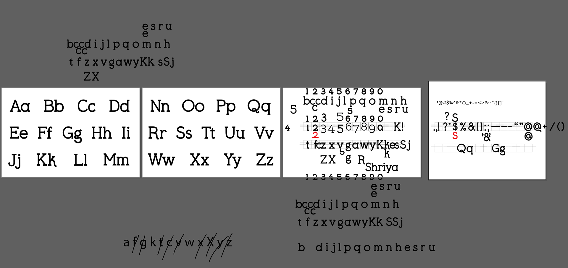
Edit Edit Edit
Edit Edit Edit
Initial letterform development in Adobe Illustrator. One of the most important things to get right is your name. If your name looks off, you need to go back to the drawing board.
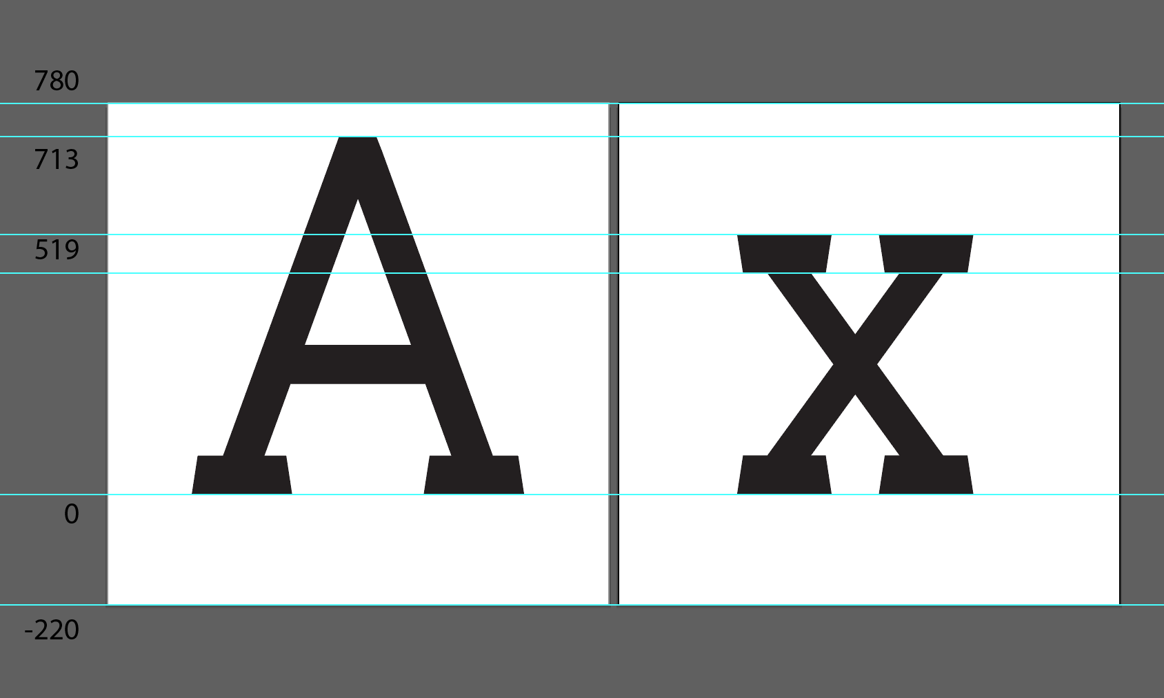
Defining the dimensions of the letterforms. This is essential for when I created the typeface in the Glyphs software.
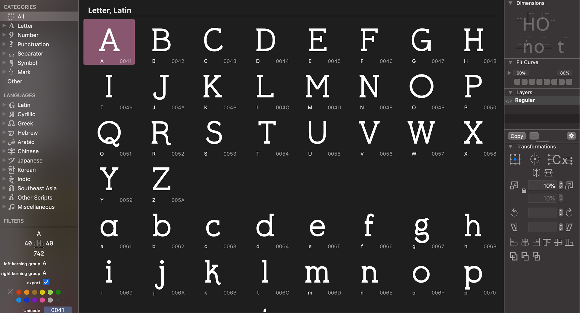
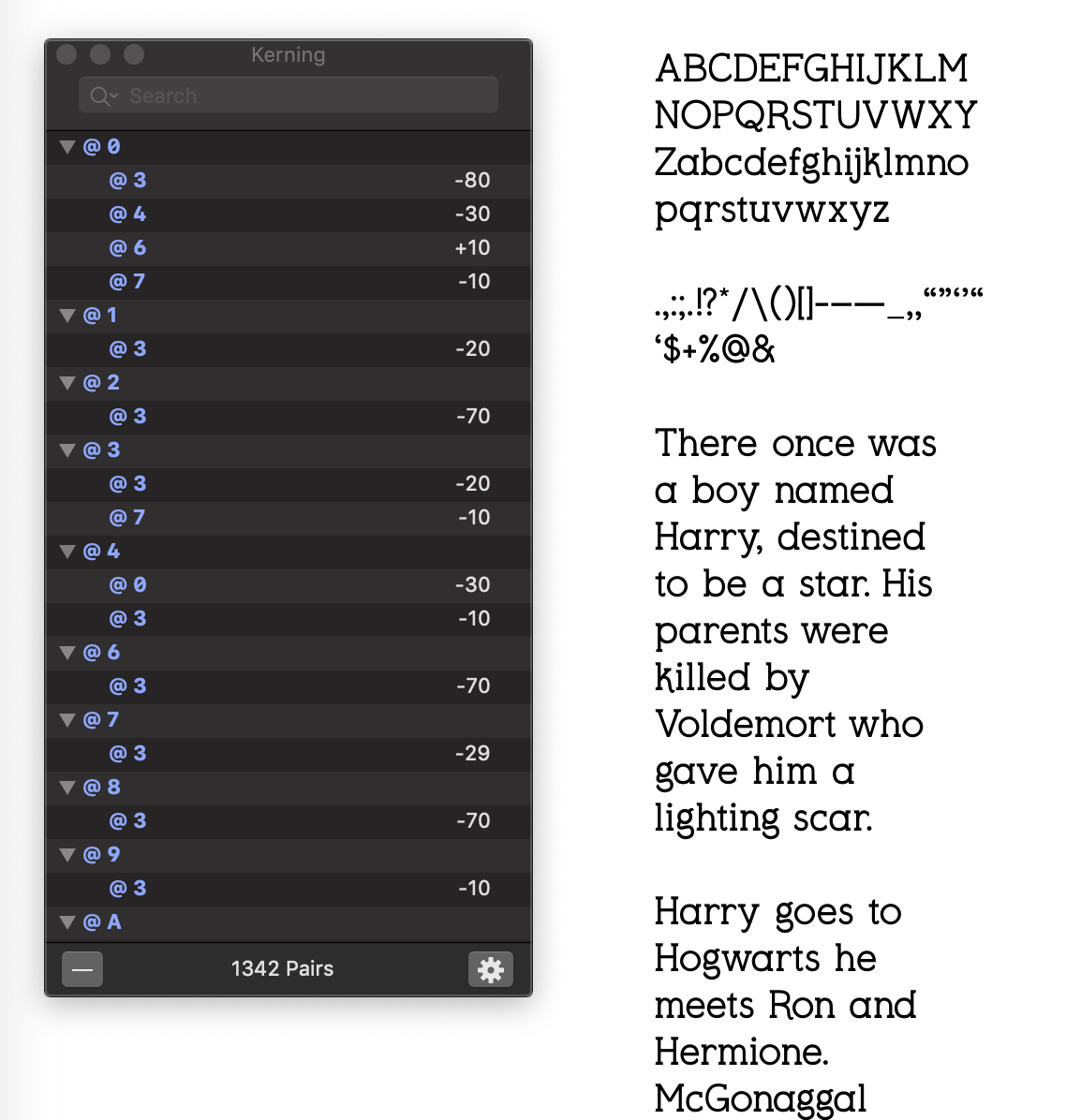
So much kerning!
Typeface creation in Glyphs software. I tested every single letter and number combination that exists and ended up with 1342 kerning pairs! This was the most tedious part of the process, but also the most rewarding! I would love to create another typeface sometime in the future.